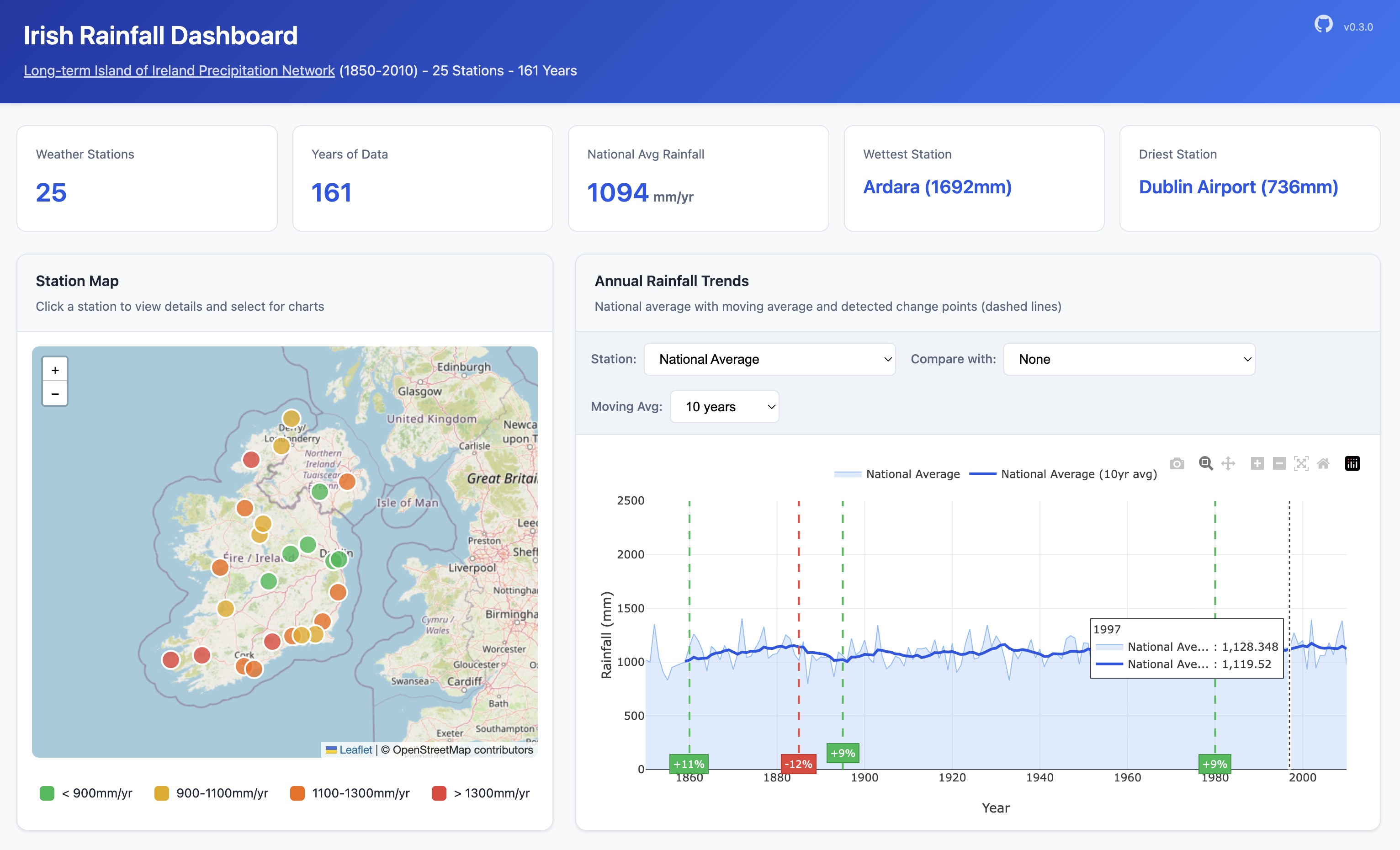
The dashboard at a glance: stations colour-coded by long-term average on the left, the national series with its 10-year moving average and detected change points on the right.
In Ireland, two things are true: people will talk about the weather, and the weather will give them plenty to talk about. But how much of what we feel about Irish rainfall — that it's wetter than it used to be, that the seasons have shifted, that some corner of Cork must surely hold a world record — actually shows up in the data?
The Irish Rainfall Dashboard is a small project I built to make that question easy to poke at. It takes the Long-term Island of Ireland Precipitation (IIP) network — 25 weather stations, monthly readings, 1850 to 2010 — and puts it behind an interactive map and a handful of charts so you can explore 161 years of Irish weather without writing a line of code.
- Live dashboard: https://irish-rainfall.joedrumgoole.com/
- Source code: https://github.com/jdrumgoole/irish-rainfall
Where the data comes from
The underlying dataset is published by Met Éireann and was reconstructed and quality-controlled by Mateus, Potito and Curley (2020). It contains monthly rainfall totals for 25 stations spread across the island, along with a national series. The dashboard pulls the raw archive directly from Met Éireann's site, unpacks it, and loads it into a small SQLite database — so the whole thing is self-contained and reproducible from a single command.
A few headline numbers to set the scale:
| Stations | 25 |
| Years of data | 161 (1850–2010) |
| National average | 1094 mm/yr |
| Wettest station | Ardara — 1692 mm/yr |
| Driest station | Dublin Airport — 736 mm/yr |
The east–west contrast is the first thing that jumps out: the wettest station in the network records more than twice the annual rainfall of the driest, and the driest sits right next to the country's biggest city.
What you can do with it
The dashboard is designed for browsing rather than dashboards-by-committee. Everything is one click away.
- Interactive map — All 25 stations plotted on a Leaflet map, colour-coded by long-term average rainfall. Click any station to drill into its data, or pick from a dropdown to highlight it.
- Annual rainfall trends — A time-series chart for any station (or the national average) with configurable 5/10/20/30-year moving averages, so you can damp out the year-to-year noise and see the underlying signal. You can also overlay a second station to compare.
- Change point detection — The dashboard runs the ruptures PELT algorithm over each series and marks the years where the rainfall regime appears to shift. It's a nice antidote to eyeballing trends.
- Monthly climatology heatmap — Average rainfall by station and month, laid out as a heatmap. The seasonal pattern across the island is immediately visible.
- Period comparison — Pick any two date ranges and the dashboard reports the percentage change between them, station by station.
- Seasonal breakdown — Winter / Spring / Summer / Autumn averages per station, so you can ask questions like "is it really the winters that are getting wetter?"
There's also a small REST API behind it (/api/stations,
/api/rainfall/annual, /api/rainfall/changepoints, …) for anyone who'd
rather pull the numbers into a notebook.
How it's built
I wanted the project to be light enough to run on a laptop and simple enough to read end-to-end in an afternoon. The stack reflects that:
- Python 3.12 with
uvfor environment and package management - FastAPI for the API and server-rendered templates
- SQLite as the data store — a single file, no daemon, perfect for a read-mostly dataset of this size
- Leaflet for the map and Chart.js for the time-series charts
rupturesfor change point detectioninvoketasks for everything admin (invoke import-data,invoke start,invoke stop,invoke status,invoke db-info)
Getting it running locally is two commands:
uv sync
invoke import-data   # downloads from Met Éireann and builds the SQLite db
invoke start         # serves the dashboard at http://127.0.0.1:8000
Why bother?
Honestly, mostly because the dataset is wonderful and deserves more eyeballs than a folder of CSVs ever gets. Long, clean, public time series are rarer than they should be, and 160 years of Irish rain is the kind of thing that rewards a little curiosity. Try poking at Valentia Observatory's winters, or Markree's change points, or what Dublin Airport looked like in the 1970s — there's a story in nearly every series.
If you find something interesting, an issue or a PR on the GitHub repo is very welcome.
Links
- Live dashboard: https://irish-rainfall.joedrumgoole.com/
- GitHub: https://github.com/jdrumgoole/irish-rainfall
- Dataset source — Met Éireann: https://www.met.ie/cms/assets/uploads/2018/01/Long-Term-IIP-network-1.zip
- Citation: Mateus, C.; Potito, A.; Curley, M. 2020. Reconstruction of a long-term historical daily maximum and minimum air temperature network dataset for Ireland (1831–1968). Geoscience Data Journal. http://dx.doi.org/10.1002/gdj3.92
The project is MIT-licensed.